In statistics, a Q-Q plot(“Q” stands for quantile) is a probability plot, which is a graphical method for comparing two probability distributions by plotting their quantiles against each other. If the two distributions being compared are similar, the points in the Q-Q plot will approximately lie on the line y = x. If the distributions are linearly related, the points in the Q-Q plot will approximately lie on a line, but not necessarily on the line y = x. Q-Q plots can also be used as a graphical means of estimating parameters in a location-scale family of distributions.
 |
 |
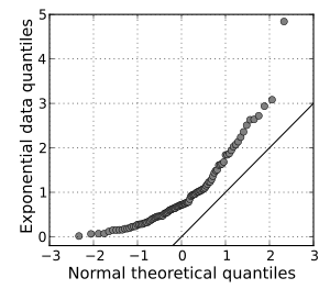
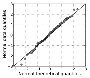
| A normal Q-Q plot of randomly generated, independent standard exponential data. This Q-Q plot compares a sample of data on the vertical axis to a statistical population on the horizontal axis. The points follow a strongly nonlinear pattern, suggesting that the data are not normally distributed. | A normal Q-Q plot comparing randomly generated, independent standard normal data on the vertical axis to a standard normal population on the horizontal axis. The linearity of the points suggests that the data are normally distributed. |
 |
 |
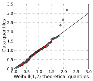
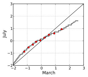
| A Q-Q plot of a sample of data versus a Weibull distribution. The deciles of the distributions are shown in red. Three outliers are evident at the high end of the range. Otherwise, the data fit the Weibull(1,2) model well. | A Q-Q plot comparing the distributions of standardized daily maximum temperatures at 25 stations in the U.S. state of Ohio in March and in July. The curved pattern suggests that the central quantiles are more closely spaced in July than in March, and that the March distribution is skewed to the right compared to the July distribution. The data cover the period 1893–2001. |
This`s from wikipedia.org. For detail, click here.

Yes, correctly.
It is quite useful for me, but I still don’t understand the last example.